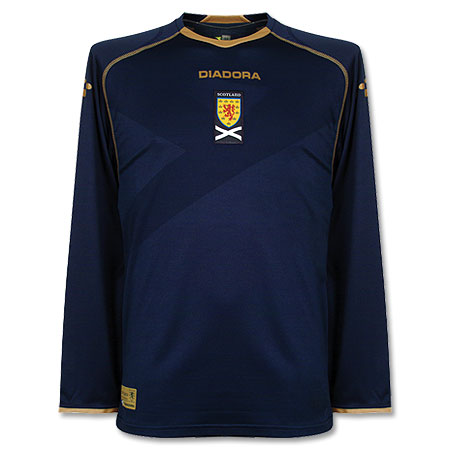
I take another look at the new Scotland shirt for the Rugby World Cup, this time up close. And come over all King Midas. With pics – I hope the colours come across okay, new camera!
First things first: when you see the shirt you think phew, it is actually navy. Although purists may baulk at the blue and gold colour scheme leaning us in the direction of the Scotland football team’s recent Diadora strip of which it is vaguely reminiscent, it is actually pretty consistent with the dark blue of the last home shirt I had (Famous Grouse special!). In certain light it seems to take on a different hue which would explain the inconsistencies in previous SRU photos. It’s not quite Global Hypercolour changeable, but some photos made it look almost royal blue. Although if you look at the saltire on the sleeve which is a much lighter blue, maybe it should be! But it’s not, it is a fairly dark navy blue (darker than said Diadora strip), which as it turns out contrasts quite nicely with the dreaded gold.

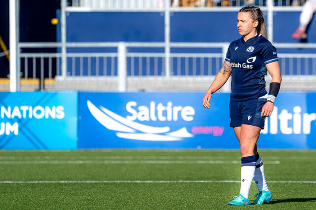
Scotland “home” kits have always been Navy and White – well, almost always anyway – and there is not much white on this one. A bit on the flag, the World Cup logo and, er, that’s it. Everything else is given over to the gold piping stuff that has been a little controversial amongst the fans I have spoken to. It’s not yellow at least, it is definitely a shiny sort of metallic thread, that is also slightly lighter on the SRU and CCC logos. I have to say, it is growing on me. You could argue its merits in terms of tradition but when England are chucking out all black strips and Wales have a bowtie on theirs we could be a lot worse off. On a purely aesthetic level I think the colours work well together, and as London Irish scrum-half Ross Samson said “Gold = Winning”. Whether the colours are right for Scotland may well be up to you.

Having said that, they could do without the stripe across the middle. I am sure that on the Test shirt – that also has those shiny bits for evading tackles and holding on to the ball – it may be a structural necessity but despite this being the “Pro” shirt (ie never closer to a rugby pitch than the stands) it will most likely only serve to make your belly look funny after a few Deuchars/Steinlagers.
Fabric-wise it is the usual slightly funny shiny fabric (100% Polyester) most modern rugby shirts are made of these days but in a sweaty pub I am sure it will serve well. There is actually a ladies version of the shirt with a collar which borders on the sensible, but this version has the replica supersciencey collar that is supposed to be unbreakable (see Canterbury’s Youtube Channel for evidence). I didn’t fancy testing this one to that level of breaking point. The collar is actually noticeable by its absence when you wear it, feeling a little airy and offering a different feel to an older rugby shirt. Which might or might not be good depending on the Invercargill weather…

Overall I like the jersey – not much a fan of the new white “away” version though, much prefer the last one – but I can appreciate the gold might be a bit of a leap for the traditionalists amongst you, and subject to taste. Remember if Scotland underperform, it is not the shirt’s fault!
Thanks very much to idealo for the provision of the shirt for review. Should you need to check prices on a variety of rugby products, then have a look here and see what you can dig up. If the gold is too radical for you I would recommend taking a look for the 2010/2011 Home Classic jersey and still at bargain prices in some places, especially if your name is Murray as it comes pre-printed on the front!


2 responses
Bless – but this is the strangest article we’ve ever put on the blog….it’s gone all Fashion Show!
..lack of sponsor on the classic replica that is